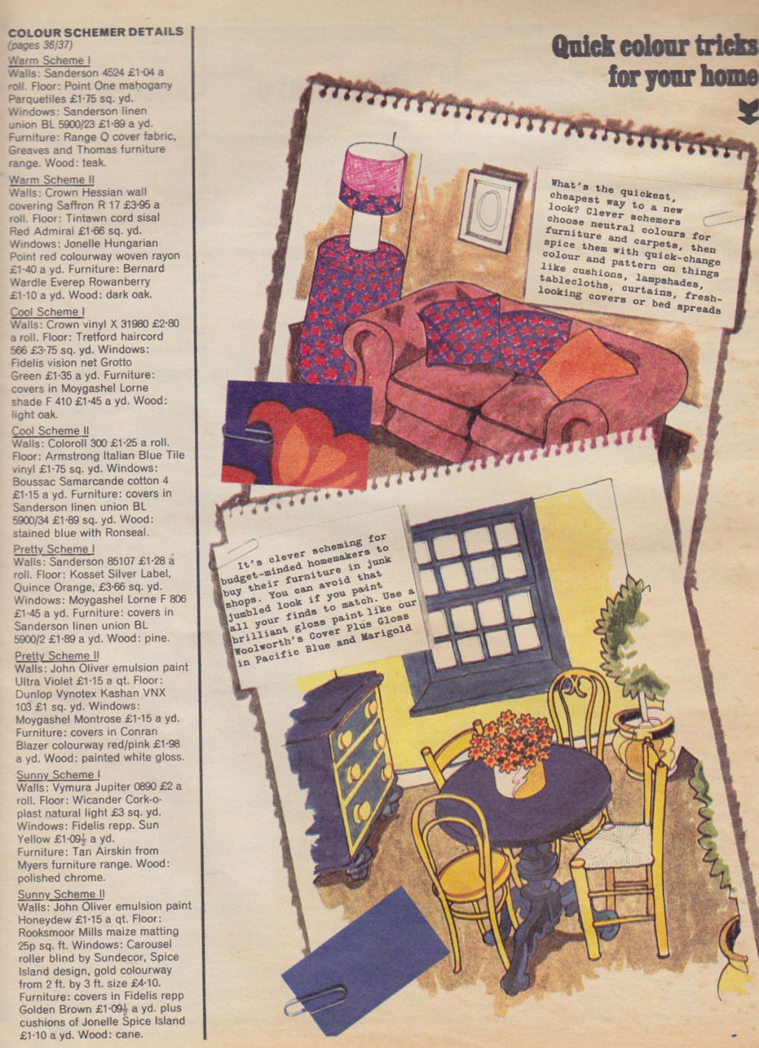
Recently whilst rummaging around looking for decoupage materials I came across an old copy of Woman’s Realm, that I had previously found under some floorboards in my old house. As mid century modern shows are so popular, See the comments at the bottom of this post, I thought I’d post this original advice from way back then. I would be very interested to hear your thought’s on the changes in interior design then and now?
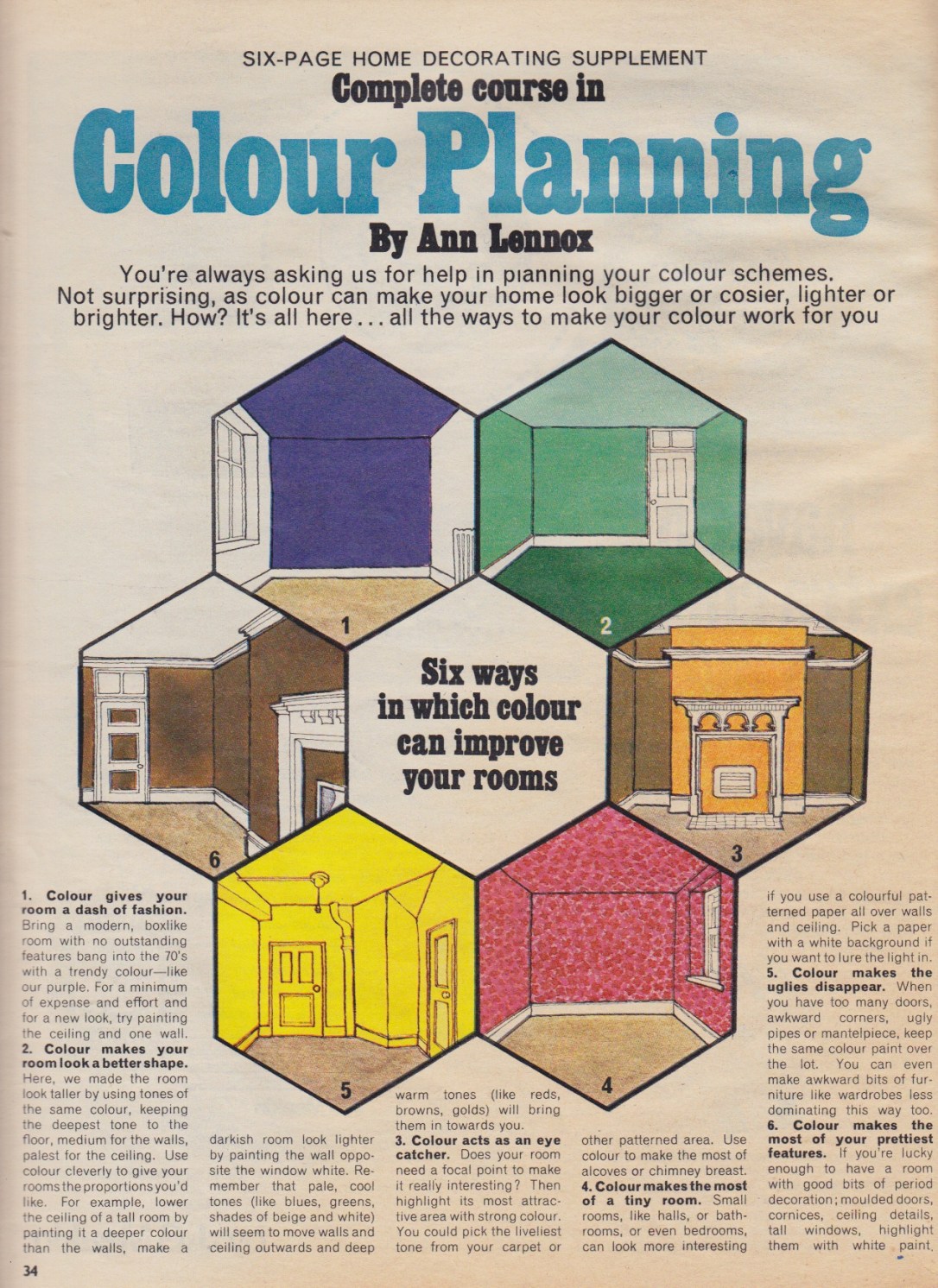
Six ways in which colour can improve your rooms:
- Colour gives your room a dash of fashion. Bring a modern, boxlike room with no outstanding features bang into the 70’s with a trendy colour – like our purple. For a minimum of expense and effort and for a new look, try painting the ceiling and one wall.
- Colour makes your room look a better shape. Here, we made the room look taller by using tones of the same colour, keeping the deepest tone to the floor, medium for the walls, palest for the ceiling. Use colour cleverly to give your rooms the proportions you’d like. For example, lower the ceiling of a tall room by painting it a deeper colour than the walls, make a darkish room look lighter by painting the wall opposite the window white. Remember that pale, cool tones (like blues, greens, shades of beige and white) will seem to move the walls and ceiling outwards and the deep warm tones (like reds, browns, golds) will bring them in towards you.
- Colour acts as an eye catcher. Does your room need a focal point to make it really interesting? Then highlight its most attractive area with strong colour. You could pick the liveliest tone from your carpet or other patterned area. Use colour to make the most of alcoves or chimney brest.
- Colour makes the most of a tiny room. Small rooms like halls, or bathrooms, or even bedrooms, can look more interesting if you use a colourful patterned paper all over walls and ceiling. Pick a paper with a white background if you want to lure the light in.
- Colour makes the uglies disappear. When you have too many doors, awkward corners, ugly pipes of mantelpiece, keep the same colour paint over the lot. You can even make awkward bits of furniture like wardrobes less dominating this way too.
- Colour makes the most of your prettiest features. If you’re lucky enough to have a room with good bits of period decoration; moulded doors, cornices, ceiling details, tall windows, highlight them with white paint.
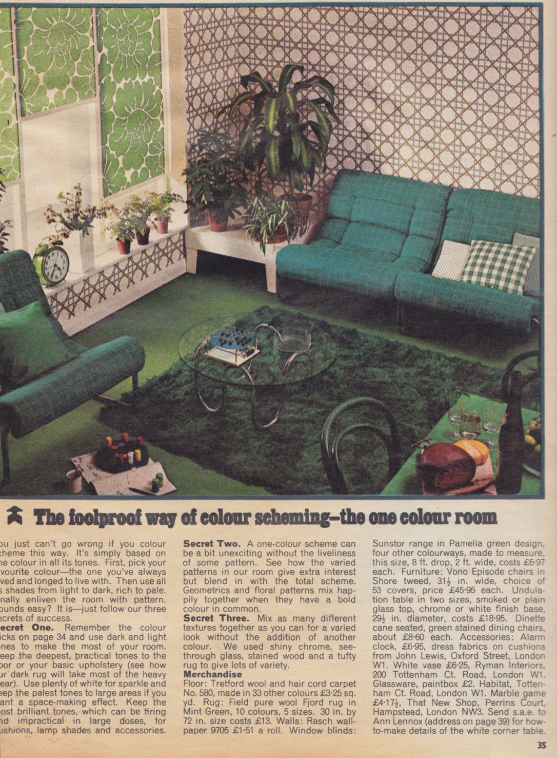
The foolproof way of colour scheming- the one colour room.
You just can’t go wrong if you colour scheme this way. It’s simply based on one colour and all its tones. First, pick your favourite colour- the one you’ve always loved and longed to live with. Then use all shades from light to dark, rich to pale. Finally enliven the room with pattern. Sounds easy? It is- just follow our three secrets to success.
Secret one. Remember the colour tricks and use dark and light tones to make the most of your room. Keep the deepest practical tones to the floor or your basic upholstery (see how our dark rug will take most of the heavy wear). Use plenty of white for sparkle and keep the palest tones to large areas if you want a space making effect. Keep the most brilliant tones, which can be tiring and impractical in large doses, for cushions, lamp shades and accessories.
Secret two. A one-colour scheme can be a bit unexciting without the liveliness of some pattern. See how the varied patterns in our room give extra interest but blend in with the total scheme. Geometrics and floral patterns mix happily together when they have a bold colour in common.
Secret three. Mix as many different textures together as you can for a varied look without the addition of the other colour. We used shiny chrome, see-through glass, stained wood and a tufty rug to give lots of variety.
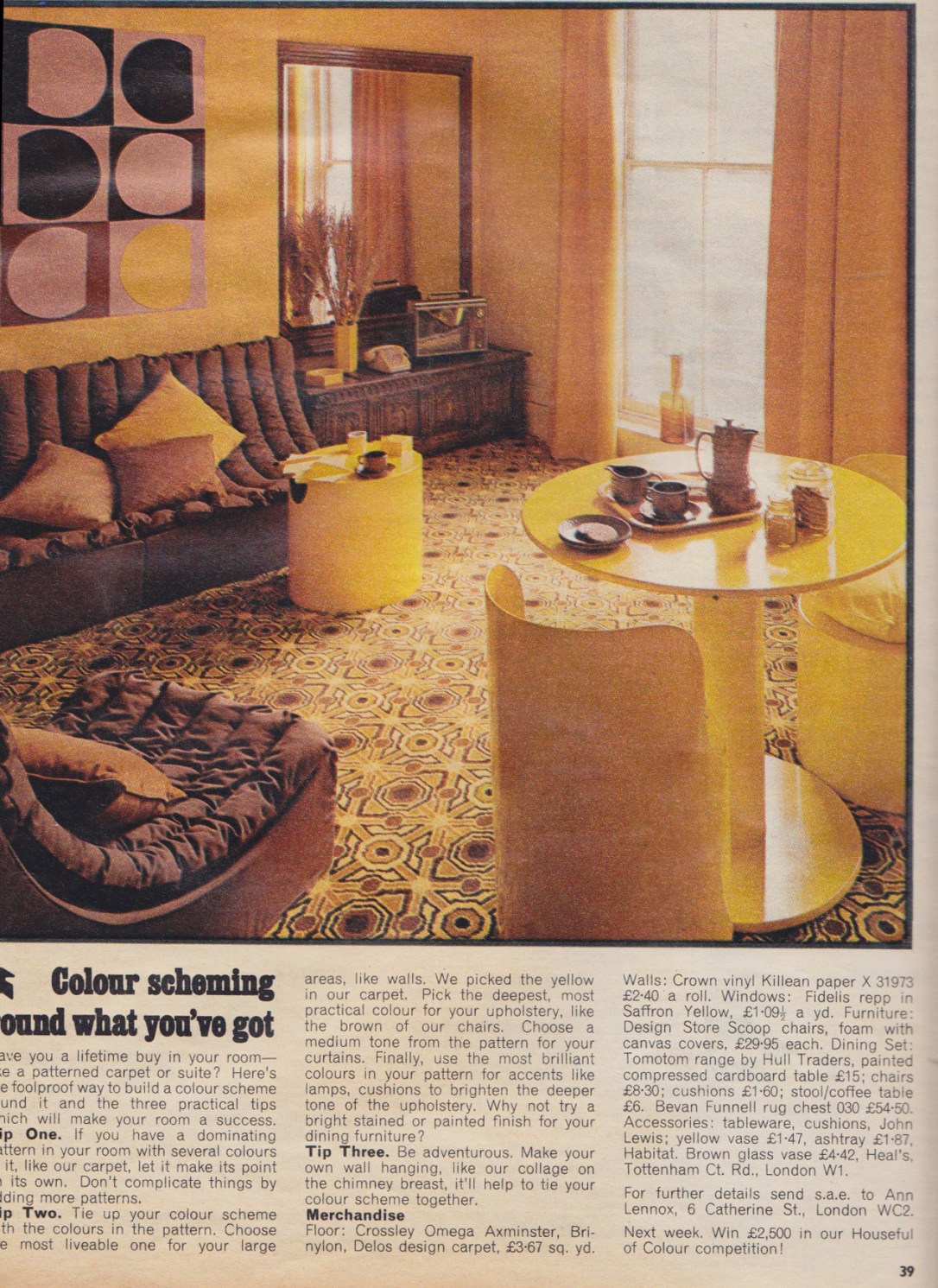
Colour Scheming round what you’ve got.
Have you a lifetime buy in your room-like a patterned carpet or suite? Here’s the foolproof way to build a colour scheme round it and the three practical tips will make the room a success.
Tip one. If you have a dominating pattern like the one in our room with several colours in it, like our carpet, let it make its point on its own. Don’t complicate things by adding more patterns.
Tip two. Tie up your colour scheme with the colours in the pattern. Choose the most liveable one for your large areas, like walls. We picked the yellow in our carpet. Pick the deepest most practical colour for your upholstery, like the brown of our chairs. Choose a medium tone from the pattern for your curtains. Finally use the most brilliant pattern for the accents like lamps, cushions to brighten the deeper tone of the upholstery. Why not try bright stained or painted finish for your dining furniture?
Tip Three. Be adventurous Make your own wall hanging, like our collage on the chimney -breast, it’ll help to tie your colour scheme together.